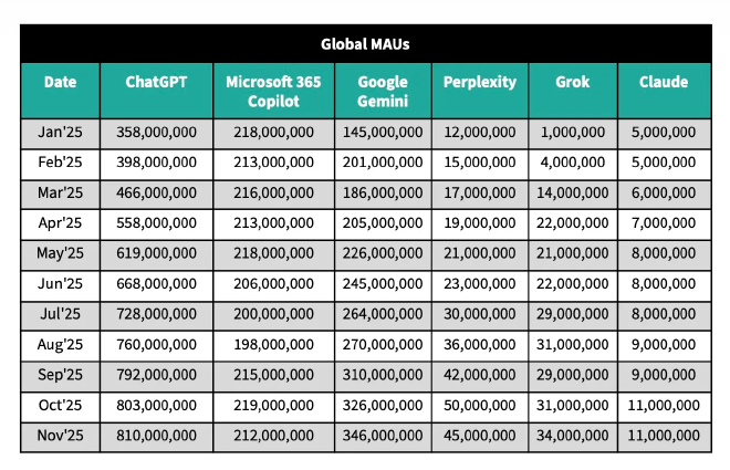
Top GPT's new viz
Table of Contents
Today one of my colleagues sent me this TechCrunch article about the monthly active usage of popular GPTs and a screenshot from it.

I decided to make a better version to let the data shine.
Nothing fancy, just simple line charts and a month-over-month table, took me 15 minutes. But what a huge difference!
How did I do it? #
- I visualized the bigger picture with a line chart and used an old trick with a max(date) reference line to extend space for mark labels — it’s a simple way to avoid using legends and keep things clear.
- I did the same for those competing in the Tier 2 league.
- I highlighted the month-over-month difference using quick table calculations and hid the first month.
Explore more of my Tableau Projects here